Major Brands Change Their Logos for the Age of Coronavirus
The coronavirus is changing the world in ways we’ve never imagined. Businesses had no choice but to close their doors in an effort to stop the spread of this vicious virus.
Some companies remain open. Others weren’t as lucky because their businesses weren’t considered essential. And we wonder what type of world we’ll live in once the major threat of this disease has finally passed.
One weird and unexpected thing about the coronavirus is how many of today’s top businesses are responding to this hazard. Not only are they taking it incredibly seriously by following all of the rules put forth by the CDC and the US government, they are also taking steps to promote social distancing in their own way.
Yes, many companies have changed their iconic logos. They are now putting space between their symbols and changing the wording to promote social distancing. While this is strange on the surface, it’s also exciting to know that big businesses are taking this risk as seriously as they should.
With that in mind, we’ll take a look at some of the biggest companies changing their logos. We’ll also go into the reasons why many of these companies have decided to do their part in an effort to spread social distancing messages.
Why Are Top Companies Changing Their Iconic Logos in the Age of the Coronavirus?
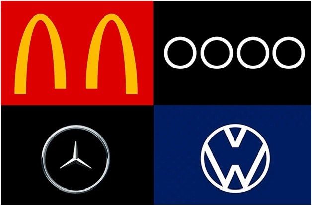
It’s hard to believe it but many of the biggest companies in the world have taken measures to spread social distancing messages by changing their iconic logos. You would have never dreamed that McDonald’s, Coca-Cola, Chiquita, and other organizations that have been around for decades would change their logo due to this threat. But that is exactly what happened.
For starters, one of the biggest changes you’ll see with logos is the way that the spacing is taking place. They are adding space between the logo images to promote social distancing.
As an example, the golden arches from McDonald’s were recently changed as they redesigned their logo to promote social distancing practices. Instead of having the two golden arches next to one another, there is now a space between each of them.
Obviously, McDonald’s took this step because they want people to see that the arches are no longer standing next to each other. They want us to see that there is a bit of distance between them because they are trying to set a good example for their customers.
Unless you haven’t been paying much attention, you know that the CDC recommends that everyone stands 6 feet apart from one another until the major danger of the coronavirus finally passes. Corporations have taken it upon themselves to change their logos in an effort to show the additional space to their customers and to keep it in the front of everyone’s mind.
Next, companies are changing their logo in an effort to show their support to those sick with the coronavirus and the brave men and women working on the front lines in our healthcare system. No one wants these people to unintentionally get sick because we failed to do our part with social distancing. That would be a terrible tragedy so companies are showing their support by separating their logo and putting space between the designs.
Third, by redesigning their logos they prove to their worldwide customers that they really care about us and want us to go on to live happy and healthy lives. Most people look at businesses as heartless organizations that hardly care about their customers. But this is not true by a long shot.
In fact, the biggest businesses in the world want their customers to know that they care, that we’re all in this together, and that they will do their part to make sure everybody is safe and healthy for as long as humanly possible.
Who Came Up with the Idea to Change Iconic Business Logos?
Believe it or not, big businesses didn’t necessarily come up with the idea to change their company logos. It was actually the brilliant idea of a Slovenia based creative director named Jure Tovrljian. In his spare time, he took it upon himself to reimagine some of the most popular logos in the world.
He remade a total of 12 different logos from iconic brands including the Olympics, the U.S. Open, Nike, the NBA, MasterCard, LinkedIn, and other big businesses. Guess what? His exciting social distancing logos caught on and many of these businesses couldn’t wait to change their logos in an effort to show their social distancing support.
This was a big win for the Slovenia creative and it was also a major win for everyone in the world. Why? This gracious logo designer came up with a way to help businesses communicate the right way and the wrong way to act in the age of the coronavirus and the time of social distancing.
Not only is this a fun way for brands to make a change to their iconic image, it’s also a nice way for them to help spread the message of social distancing. It’s a wonderful way to teach their customers or remind them that they need to stand far apart from each other in an effort to quell the spread of this dangerous virus.
These redesigned logos are very exciting to look at but they can also be a bit depressing as well. No one wants to stand far apart from one another and that is the part that is depressing to some of us. But at the same time, the logos are exciting because it shows that we really are all in this together.
We really are working toward the same goal which is to end the coronavirus menace. And we really want the best for humanity and everyone on this planet, whether they are old, young, middle-aged, sick, healthy, or anywhere else along the spectrum.
How Big Businesses Changed Their Iconic Company Logos
The interesting thing about these logo changes is the way that they altered their designs. These companies didn’t change their logos to make them look more attractive or appealing. They did it to flatten the curve and remind us that we need to stay separated in order to kick coronavirus’s ass.
Audi, the automaker, made a major tweak to their logo. Their original logo is four intertwined rings. Well, as you can imagine, they separated the rings with space in between in an effort to remind us that social distancing is important.
Chiquita, the fruit company, removed Miss Chiquita from their logo, and she is the major representative of their brand. Why did they remove her? They removed her to remind people that it’s time to stay at home and remain inside for the time being as we wait for the coronavirus to no longer act as a major hazard to our health and well-being.
Coca-Cola also changed their iconic logo. While it looks very similar because the script and the wording is the same, each one of the letters is now wide and spaced out with a lot of extra room in between. Obviously they wanted to remind us that we need to keep social distancing in mind to quell this viral menace and prevent it from needlessly killing more people.
Volkswagen, the automaker, also took steps to change their iconic logo. The original logo had the V and W right on top of one another. They have now separated the V and the W to remind us about social distancing because they want to help us flatten the curve.
Final Thoughts
As you can see, our major brands are working hard to do their part to help us end the danger posed by the coronavirus. They want their customers healthy, happy, and well. Not because they just want to make more money, although that’s definitely part of it and there’s nothing wrong with it. They genuinely care and they want to see everyone begin to feel better as this dangerous sickness dies out and disappears once and for all.