Why Your Website Needs a Responsive Website Design?
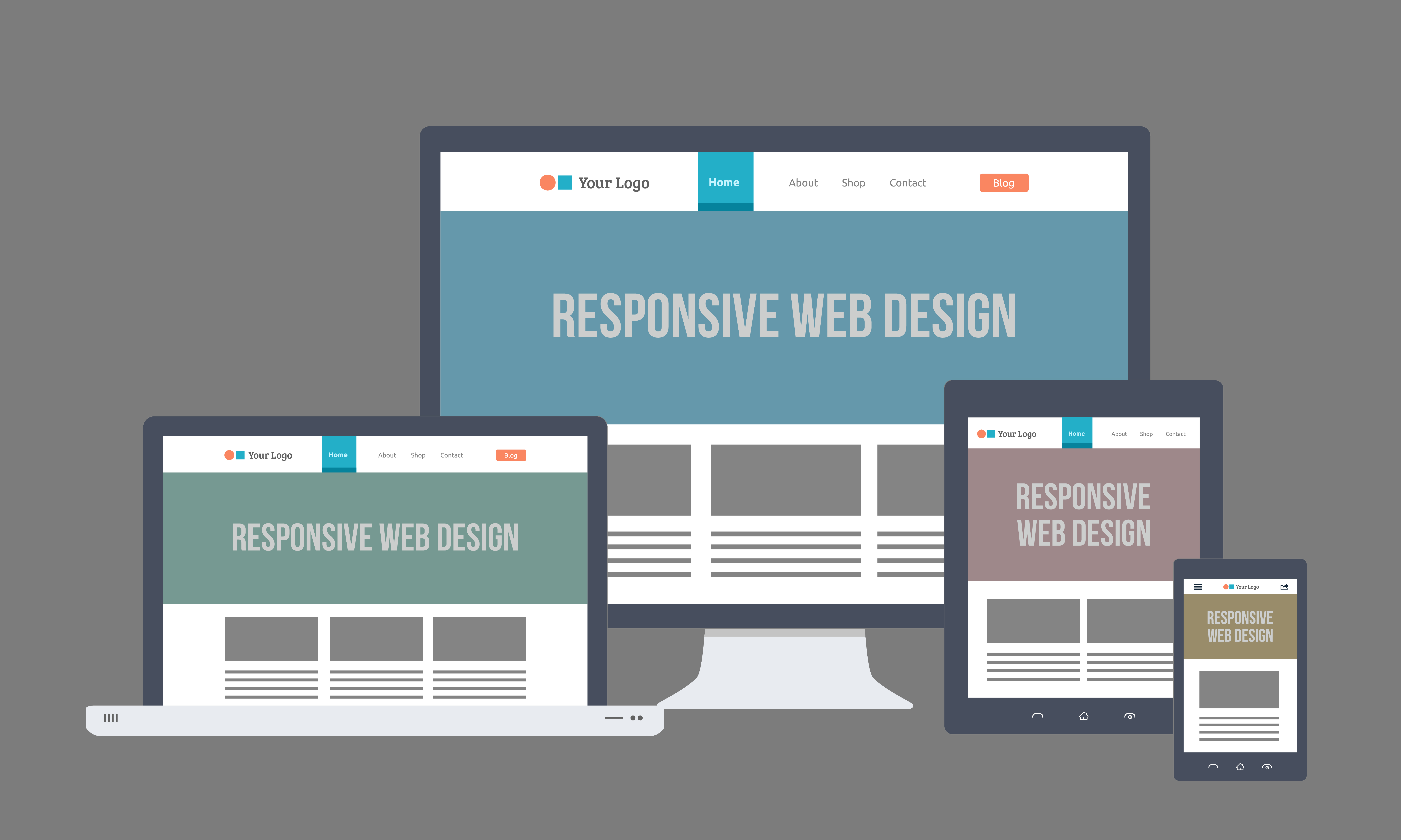
Responsive website design is an approach to design a website that allows web pages to be not only clearly view able on the desktop but also on any size or type of devices. A site designed with a Responsive website design uses the layout of the viewing environment by using fluid, flexible images, proportion-based grids, and CSS3 media queries.
- Fluid Grid: Call the page element in the relative image like percentages, not in absolute units like pixels or points.
- Flexible Images: Call the page element in relative unit. This helps the page to get loaded perfectly as per the size of the device.
- Media Queries: Allows the page to use different CSS style rules.
The need for responsive website design is not just to make a website to get opened in all devices, but it also helps to drive more traffic to your website. In this article, we are going to discuss the 7 reasons why your website needs a responsive website design.
1.User Are Now Using Multiple-Device To Seek Information
Now a day, consumer uses variety of different devices and screen sizes to view website. For this your website must work well regardless of which device the consumer may be using at that time. This also means that when a user visited your website for the first time must feel the same when they switched to see your website with another device.
2. One Site to Rule and Manage
If you design your website for the desktop version and mobile-only approach is two different coding. It will be problematic to keep both the website updated at the same time and your work is being will double. To keep this problem at bay, you can opt for responsive web design. This will make your work easy, as you just need to change it for once and all the changes will be visible to any device user uses to visit your website.
3. Increase in Online Shopping through Mobile
There is no one in this modern age who don’t shop online. A recent statistic shows that 80% of consumer regularly use phones to shop online. This statistic clearly shows why your website need to be responsive. So, not only make the shopping experience of the consumer good at desktop version but also in mobile version too or on any type of device the consumer is using.
4. Increases Popularity in Social Media
Peoples are more active in social media. They always want to stay connected to brand, offers, latest news, etc. A statistic shows that 55% of social media consumption now happens to mobile devices. So if you share your website links on any of the social media like Facebook, YouTube, Twitter, or Google Plus. It must get properly opened and the social plug-in must be active to connect your website.
5. Helps to Increase SEO Ranking:
Google announced Mobilegeddon update on April 21, 2015 and boosted the ranking of websites that are mobile friendly. In a recent statistic shows that 60% of all website traffic are from mobile devices. Google likes responsive sites with single URLs for all the different version of website to be easily viewable. Google has a different search algorithm for website to get ranked on the mobile. So, if you wanted to get first place in mobile search built your website SEO friendly with mobile version too.
6. Responsive Websites Provide a Better Consumer Experience
You created a website for the consumer, not for yourself. So consumer needs a simple and a responsive website. Your website goal should be to provide a better user experience for your consumer. A responsive website will make the consumer avoid unnecessary zooming and pinching, side scrolling, unreadable fonts and small picture. A responsive website makes your consumer to see an entire site on their device.
7. Can Become Bathroom Partner
This benefit must have raised your eyes, however, its the fact that 75% user brings their smartphones to the bathroom. So for this make your website responsive.
To make you remember the benefits of responsive website, you can mug of these bullet points:
- Future proofing.
- Better, faster, smarter consumer experience.
- Cost Effective.
- SEO optimized.
- Improve conversion rates.
After knowing about the benefits of responsive website, let’s look, how to find someone who can fulfill your requirement to make our website responsive.
It is very difficult to say which is the best responsive web design company. However, here are the few criteria which can help you to find the best one for your need-
- Check if the company own website is responsive or not.
- Look for the company that shows their previous work in the portfolio.
- Check the other client website from their portfolio and do your basic testing.
- Compare the price for developing responsive website.
- Evaluate the online reviews about the website working and services.
Conclusion:
Responsive website is not just a trend, however, it is the need of today’s online business. It makes the user engaged with your website and have an experience that make them return again to your website. So Go responsive! As WE ALL LOVE RESPONSIVE WEBSITE and WEB DESIGN.
About The Author